Design for Drupal
At ComputerMinds we know that technical know how only gets you so far when it comes to modern Drupal development and to get the most out of your new site you need a thought through, engaging design. Many of our clients already have these in hand but if you don't fear not as we're here to help!
From wireframes to wonders

Starting a design project
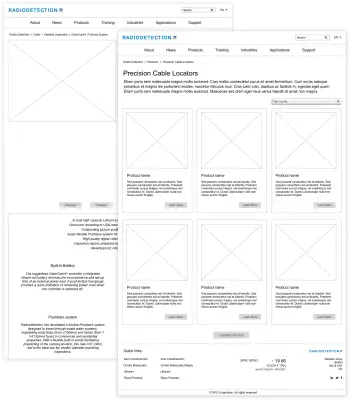
At beginning of the design process we start by using wireframes to quickly draw up a skeleton of how your finished design should look. By taking this approach we can quickly and easily agree with you how pages will be structured and what components we should show to the user and where. This approach saves both time and money as we're only interested in the bare bones at this stage and only once we've agreed how things should look do we move onto the next, more expensive stage of actual design. By working in this way we don't have to go through lots of iterations of design as we've done most of the heavy lifting in wireframes allowing our designers to concentrate on what they're good at!
A key part of the wireframing process is the user experience of your site. When drawing up wireframes what we're really concerned about is how we can best structure things to make your user's experience of the site to be a smooth as possible. So we think about things like 'where can we best position the login form' or 'where should the main navigation menu go' as black boxes; we don't care about how these things will actually work at this stage, just how we can best present them to your users.
Responsive designs to suit all devices
When it comes to modern web design being responsive is key. What this means is that when it comes to designing your new Drupal website we consider how it will render on a range of devices right from the beginning of the design process. The advantage of this approach means from the off we look at the key components on each page and how we can tweak the style on these to get them to render just the way we want on a number of different devices. The result of this is that we have one code base which will be suitable for the plethora of devices users now use to consume content online.
Reusable code and content = consistency
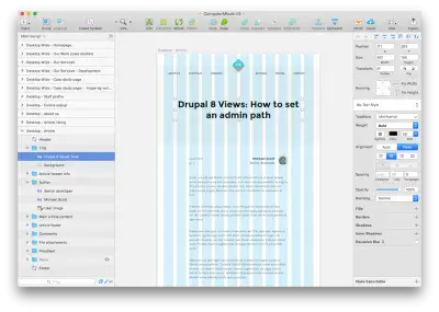
When it comes to building a Drupal website we try to write our code so that it is as generic as possible to allow chunks of functionality to be reused without having to rewrite everything every time we do so. So why should design be any different?! In reality pages across your site will all share components, an obvious example would be a navigation menu that appears on all of your pages.
In the olden days this would be added to each page design in turn essentially just copying and pasting between the various pages you have designs for. However, what happens if you want to change this? Suddenly you have loads of places which you need to change to keep things consistent!
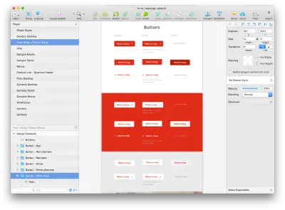
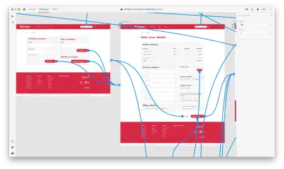
Our approach means we design reusable components once and insert these as symbols which we can update from one place. This means that if we add something like a menu to the header of a page and later on we want to tweak this we can just tweak the symbol and our changes will be automatically reflected where ever that symbol is used. The result being designs that are consistent, no matter how much we make changes to them!
Linking design pages in to a working prototype allows clients to see the changes by interacting with a working site. These prototypes are delivered via a secure link and password and updated as frequently as the client requires.
Within the prototypes delivered clients are able to place pins and comments to accurately communicate concerns or questions to our designers.
Finishing, testing and signoff
We appreciate that when it comes to design the technical side of how we do things is all reasonably irrelevant if the finished designs don't marry up with your expectations. As with our technical development offering everything we do at ComputerMinds is driven by a passion for quality and design is no different. We will work with you through the entire process to make sure that what we produce is being constantly informed by your input.
Once we have produced a final set of designs we realise that these will normally go through a few rounds of minor tweaks to get everything looking just the way you want.


